		if (typeof window.devicePixelRatio != 'undefined' && window.devicePixelRatio > 2) {
			var meta = document.getElementById ("viewport");
			meta.setAttribute ('content', 'width=device-width, initial-scale=' + (2 / window.devicePixelRatio) + ', user-scalable=no');
		}
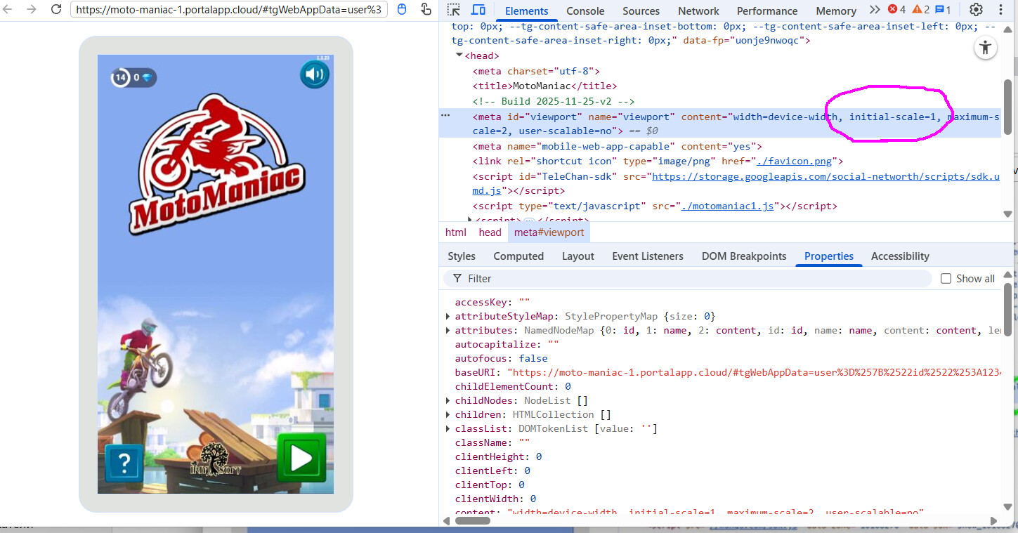
This causes the games running in a Telegram Mini App to scale in a wrong way for me on Android phones with high pixel ratio (in my case it was 2.625), like this:
I have never figured out exactly why that code is there. It’s certainly something I plan to look at more deeply when I have the time. I suspect that we will possibly remove it because it has some pretty serious downsides. Not just aesthetic issues either. At very high pixel ratios, it renders at a much higher resolution than it needs to, which can lead to memory and performance issues.
Some quick investigation led me to the following commit, which shows that this code has been in Lime since Joshua seems to have started work on the html5 target in Lime version 2.0.0 in 2014.
From my side, I can add my two cents: right after the mentioned topic, we removed this piece of code from custom template and deployed the change to production with ~25k DAU. The issue with Telegram Apps (and, as far as I remember, Facebook Instant Games as well) was resolved. No negative side effects were discovered after the removal.
Cool, but was the same app available as a standalone HTML5 app too? I mean, may this change cause issues in the browser games that work as is or in iFrame etc.?
This is why I wanted to know the reason for having this code in the template
The app works perfectly fine in an iFrame in VK and Facebook Instant Games (desktop and mobile browser versions). No changes or issues have been observed.

