.
Starling "cannot display some very delicate and detailed effects?
.
For example, using ‘GlowFilter’ will cause problems
.
After debugging, I found that this is an issue caused by “quality: Float=0.5” in “GlowFilter”
.
quality = 0.5

.
quality = 0.2

.
quality = 1
![]()
.
If the ‘quality’ is less than 1, a ‘grid like’ pattern will appear around it ..
.
Returning to the title, is it because “starling” cannot display very delicate and exquisite effects due to “grids, triangles, quadrilaterals”?
.
.
For example, if I want to display text with a size of 14, I put the text into the interface container. The interface container is scaled to fit the screen, and the text is in the interface container, causing the text scaling to blur.
.
![]()
.
For clarity of text,
I used a 14 * 2 scaling scheme and obtained the following text effect
.
![]()
txt.format.size = 14 * 2;
txt.scale = 14 / (14 * 2);
.
I quickly stopped this method because it resulted in inconsistent stroke sizes in the text, which can be observed upon closer inspection
.
This is the solution I am currently using, and I have achieved a clear text effect with consistent stroke size, which is based on texture size
.
![]()
txt.scale = 1 / txt.parent.scale;
txt.format.size = 14 * txt.parent.scale;
.
If everyone has a better way, please feel free to communicate
.
.
Okay, I’ll put together the effects of these two methods for everyone to see
.
a
![]()
.
b
![]()
.
.
I believe everyone has seen the effect. Method A causes inconsistent closed-loop, while Method B has consistent strokes
.
The text mentioned above is not bitmap text, but true type text actually drawn by “starling”
.
I feel that bitmap text is not suitable for displaying very small text effects, especially those with filter outlines and strokes. The display effect of bitmap text is not as delicate and exquisite as true type text
.
I am more inclined to pursue exquisite and delicate effects
.
Speaking of bitmap text, the display effect of bitmap text is not very satisfactory.
.
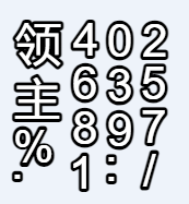
For example, if the text size of the bitmap I want to display is 14, then the font size of the bitmap I create is 14 * 3=42, which is compatible with moderate scaling and clarity
.
face=“sans-serif” size=“42”
.
var textField = new TextField(100, 100, “领主 100.00%”);
textField.batchable = true;
textField.autoSize = TextFieldAutoSize.BOTH_DIRECTIONS;
textField.format.setTo(bitmapFont.name, 14, 0xFF9933);
textField.format.letterSpacing = 2;
textField.x = -textField.width / 2;
textField.y = 188 - 20;
this.addChild(textField);
.
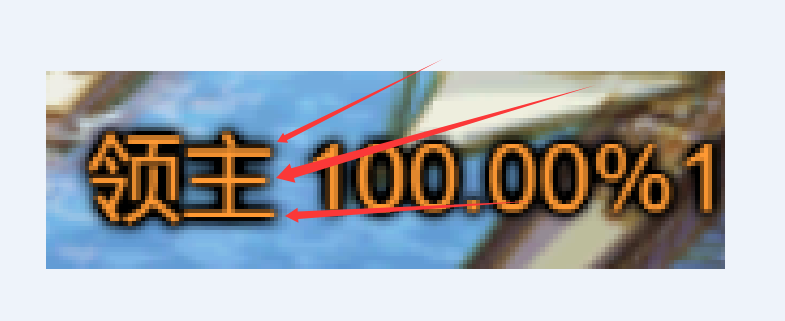
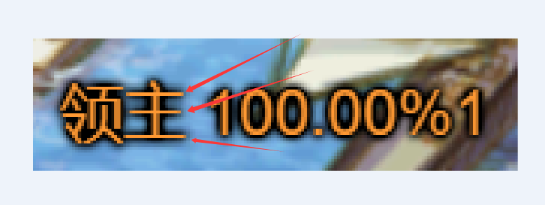
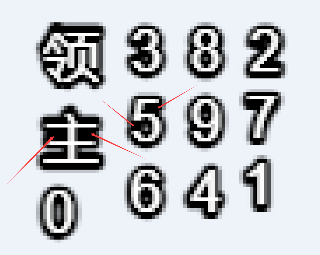
I got the following effect, but the edges caused the problem, which is why I said bitmap text is not suitable for displaying smaller text effects
.
![]()
.
.
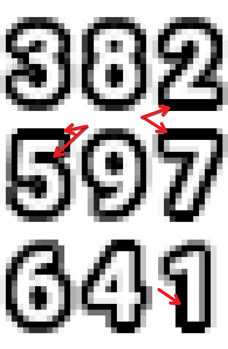
In order for everyone to see these details clearly, I enlarged the picture
.
.
Displaying half the size has a significantly better effect
.
face=“sans-serif” size="42
textField.format.setTo(bitmapFont.name, 42 / 2, 0xFF9933);
42 / 2

.
.
Ah。 Is font size/2 more effective? The font size for this production is 14 * 2=28
.
face=“sans-serif” size=“28”
textField.format.setTo(bitmapFont.name, 28 / 2, 0xFF9933);
14 * 2 = 28
28 / 2 = 14
.
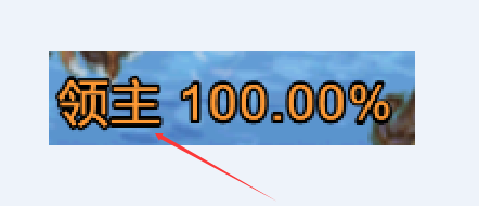
显示大小为14的位图文字
![]()
.
If you look closely, you can still see some subtle changes. Scaling bitmap text can cause problems, especially when there is a large difference in scaling. Therefore, try to scale bitmap text as much as possible without too large a difference. That’s why I say that displaying small text on bitmap text is not effective
It’s trying to interpolate a heavy stroke and text, down to that very small size. Pretty much any software is going to struggle with this.
Here’s what Gimp produces (natively, not generated by an external bitmap font generator):
If I may gently share some thoughts, modern design leans less on things like drop-shadows, bevels effects, and glows, except where such things may subtly improve readability. That is, they’re used less for design, and if they’re used, it’s for readability.
Small fonts are hard to read. Add borders, bevels, glows, etc to those fonts, and they’re probably going to be harder to read again.
Contemporary design leverages simple flat colours. Let “exquisite” fonts shine in their own right, not because they have all sorts of (often unnecessary) effects added to them.
Now I understand in this case, the border is probably necessary in order to make the white text readable. I’d like to suggest though, that’s a design issue, not a technical issue. Rather than spending the last two months trying to solve what others in all development spheres have been wrestling with for years, accept the limitations and adjust the design where that is feasible.
I offer these thoughts, understanding you may have constraints that limit your options. Perhaps others have designed it and you’re receiving pressure to simply implement that.
.
Ah。 You actually said that contour tracing filters are rarely used? How is that possible? Do you think you don’t develop games and don’t play games on a regular basis? I can only say that the use of luminescent filter contour tracing is very high in games and has become a default method.
.


Point well made.
Best of luck with accomplishing your goal.

