I’m really struggling to use small emedded dynamic fonts in OpenFL (c++/windows target).
Below a certain size they look horrible…aliased and blurry… what can be done to improve this?
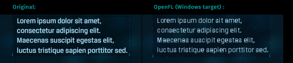
Se what i mean:
Regards

I’m really struggling to use small emedded dynamic fonts in OpenFL (c++/windows target).
Below a certain size they look horrible…aliased and blurry… what can be done to improve this?
Se what i mean:
Regards
You could play with these settings, and see if you get better results?
Thanks, but seems like there is no effect by doing any changes to this…? Is CairoTextField being used for creating textfields on windows c++ target? The textfield are in an Swf / MovieClip asset…
Oh, a SWF. Is it editable text? If so, it should be using the TextField class, if not, it’s drawn using .graphics
Yes… this is with dynamic textfields… Static textfields look ok!
Any options for this in the TextField class?
If it’s dynamic, it should be going through the above code. Does it look different if you run with -Dcairo instead?
Unfortunately no… even with -Dcairo it’s the same… Changing anything at all in the CairoTextField class does not seem to have any effect…
Yeah, i have this same issue… Ive played with the settings in cairo text field previously and got better results, but still not perfect. In my mind its quite a big issue as the whole app looks pretty crappy with this type of blurring.
Ill do some investigating and see if anything makes sense. Are you using default fonts? Or custom fonts?
Hi! Yeah small fonts look quite bad… Is this a known issue with the cairo text renderer i wonder? …
Text in flash look great, but in c++ thats not the case… Im using custom .ttf embedded fonts…
This might be because pixel snapping is not applied to rendered text and is placed between pixels.
I’ve also noticed that text is much thinner on OpenFL. Probably because of auto hinting.
In Font.cpp font is loaded with “FT_LOAD_NO_BITMAP | FT_LOAD_FORCE_AUTOHINT”, and in CairoTextField.hx hinting is enabled under specific conditions.
I’m not sure how FreeType interacts with Cairo. Do both two libraries apply hinting? You may end up applying too much hinting with those settings anyway.
https://www.freetype.org/freetype2/docs/reference/ft2-base_interface.html#FT_LOAD_NO_BITMAP
https://www.freetype.org/freetype2/docs/reference/ft2-base_interface.html#FT_LOAD_FORCE_AUTOHINT
https://www.cairographics.org/documentation/cairomm/reference/namespaceCairo.html#a42c908e3a6e1e7e402081b36659b42e4 (Description of Cairo’s HintStyle)
So i’ve found the reason for this issue : options.hintStyle = CairoHintStyle.DEFAULT;
This is what is causing the horrible look on the font, and by changing it to : options.hintStyle = CairoHintStyle.SLIGHT; the font looks smooth and nice.
Also; by changing options.hintMetrics = CairoHintMetrics.OFF to ON we get much better letter layout in the textfields… but this causes textfields to clip at the edges sometimes…
@singmajesty Could anything be done to improve the font settings permanently?
Thanks for the help, I’m going to use SLIGHT as the default in the builds for now, and see how that pans out. Perhaps it’s a better default value for us 
CairoHintMetrics.ON looks better, but it messes up our layout calculation. Fundamentally we use a library called “harfbuzz” which handles complex text layout (including right-to-left, top-to-bottom, Arabic and other scripts) but don’t use that layout information to render the individual glyphs. This creates a disconnect between our layout calculation and final rendering, which is an issue.
So the fonts certainly look better, but i still get some dithering:
Any thoughts?
Also, regarding CairoHintMetrics.ON are there plans to use this somehow? Or maybe an option or something? Text spacing etc certainly looks better with it.
We could only use CairoHintMetrics.ON if we disregard our text measurements. I don’t think we can use Cairo for text measurements, but I wonder if there’s a way to improve the metrics from Harfbuzz. In the future, we should use Harfbuzz for our layout, then render each glyph individually and not rely on cairo.showText for lines of text
Actually, this looks promising:
Perhaps we could set hb_ft_font_set_load_flags with hinting enabled, then (for the time being) use CairoHintMetrics.ON as well.
After some digging, this is available in newer releases of Harfbuzz. I tried to force the load type by hardcoding changes in our older version of Harfbuzz, but this still resulted in a layout that does not match with the Cairo render, but this is progress toward a better, more accurate TextField.
This may help explain why trying to make a renderer that relied entirely on the Harfbuzz positions didn’t look right