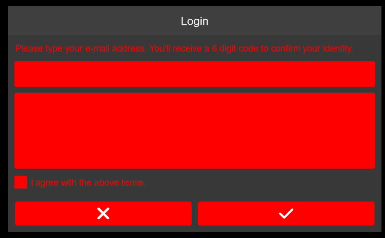
Hi, I’m using the feathers.themes.steel.SteelTheme as a simple base to create a custom theme. I checkd out and it has several properties defined at the BaseSteelTheme class for the colors, like “themeColor”, “offsetThemeColor”, “rootFillColor” and so on. Is there an easy reference to know what part of the UI each of these values are connected?
I’ve added some descriptions for you.
Wow, nice!
Thank you a lot!
What about these gray backgrounds (header and window) and header text color? Can I set them using these values? I expected them to be headerFillColor and rootFillColor, but setting tem does not change it. I can change the header text color using its textformat property, but is it possible by simply adjusting one of these values?
Edit: well, I can always set these areas backgroundSkin directly. Just checking of the theme supports it.
What about these gray backgrounds (header and window) and header text color?
The Panel component uses containerFillColor for its background.
The Header component uses headerFillColor for its background.
I can change the header text color using its textformat property, but is it possible by simply adjusting one of these values?
Most components use textColor by default. There isn’t a property that is used for the text color of a header only. If you change textColor, it will affect many components.
You should set the textFormat property. You can either do it directly, or you can create a custom variant in a custom theme.
well, I can always set these areas backgroundSkin directly. Just checking of the theme supports it.
If you want a different background than the default, you generally need to set backgroundSkin somewhere. Either directly on the component instance, or by creating a custom variant in a custom theme.

