I know this question is perhaps more suited for Stack Overflow, and probably rather noob-ish of me to ask, but I would rather a response from a community I know is more forgiving of other peoples’ mistakes.
So here’s my question for those HTML devs that know better than I.
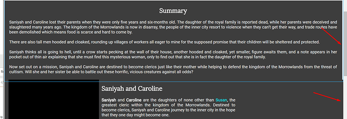
In a HTML page, when you have various elements stacked below one another, you will sometimes get into the problem where the width set to 100% does not properly match that of the window assuming all such elements are attached to the body.
My HTML source looks like this:
   <body>

        <ul id="menu-bar">
            <li id="link-home" class="active"><a href="#home">Home</a></li>
            <li id="link-summary"><a href="#summary">Summary</a></li>
            <li id="link-characters"><a href="#characters">Characters</a></li>
            <li id="link-places"><a href="#places">Places</a></li>
            <li id="link-about"><a href="#about">About</a></li>
        </ul>

        <div id="home">

            <div style="text-align:center">
                <img src="img/placeholder.png" width="200px" height="250px" style="margin-top:20px;" /><br/><br/>
                <a class="button-inactive">Unavailable to purchase</a>
            </div>

        </div>

        <div id="summary">

            <div class="bar">
                <h2>Summary</h2>
                <p>dsfdsfdsf</p>
            </div>

        </div>


        <div id="characters">
            <div id="saniyah-and-caroline">
                <div class="container">
                    <img src="img/placeholder.png" width="350px" height="400px" style="position:relative;float:left;margin-right:10px;" /><h2>gshsghgfs</h2>
                    <p>dfgdfhdfh</p>
                </div>
            </div>
            <div id="johiah">
                <div class="container">
                    <h2 style="text-align:right;padding-right:15px;">fdsgdfg</h2>
                    <p style="padding-left:15px;padding-right:15px;">adgdfgdfgd</p>
                </div>
                <img src="img/placeholder.png" width="350px" height="400px" style="position:absolute;z-index:100" />
            </div>
        </div>

    </body>
Most of these elements are position:relative but this does not apply a width:100% properly to the window, which you would expect. Instead, a common solution that I find to this problem is to encapsulate an absolute positioned element inside of a relative element (to ensure correct flow) and then setting width:100%.
The next problem is with elements that then stack on each other with the position:relative style.
The #summary div block has the following CSS:
#summary {
    width: 100%;
    display: block;
    position: relative;
    margin-top: 15px;
}
You would think the element would stretch to 100% of the window, since it’s parent is the body, but it doesn’t. This can be resolved by applying position:absolute instead, but then you get into the problem with flow again.
The element underneath it, #characters, has the following CSS:
#characters {
    background-color: #3D3D3D;
    display: inline-block;
    width: 100%;
    position: absolute;
    margin-left: -8px;
    height: 810px;
}
In the above, I specify a height as well as the position:absolute. However, if I applied absolute positioning to the element above, the aforementioned element will be hidden because the #characters will be pushed up to the next element that has a position:relative style.
So here’s my question: How do you apply positioning to elements such that you can maintain a proper 100% width without causing flow issues?


