
Hey all!
I bet all of you - just like me - want to give our users the best visual
experience they can get! So instead of setting our HTML5 projects to a fixed
size, we’re using OpenFL’s special width=0 height=0 feature by adding this
line to project.xml:
<window width="0" height="0" resizable="true" if="html5" />
At startup of an application I’m querying the current browser window’s size by:
Lib.application.window.width, Lib.application.window.height and resize my
onscreen objects accordingly.
This looks crisp and clean - at least on a desktop monitor. While checking
one of our games on an Android device lately, I discovered the crispy cleaness
turned into a smoothed blurry mess.
After some extensive research I found that it might have to do with the backing
store the browser uses to keep track of pixels before it draws something onto
the onscreen canvas which might be of a different resolution. Indeed that particular
Android device returns a window.devicePixelRatio of 1.5 vs 1.0 on the desktop monitor.
Searching the OpenFL forums revealed a post where singmajesty mentioned support
for high DPI is disabled for HTML5 by default for performance reasons but can
be activated by adding this niftly little line to project.xml:
<window allow-high-dpi="true" />
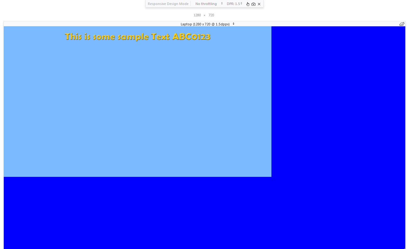
Well, after adding it the application doesn’t cover the whole screen anymore
and looks a little something like this now (tested using FireFox’s responsive mode @1.5 DPR):
Okay the fix is simple - multiply the width & height obtained by Lib.application.window.width
and Lib.application.window.height by 1.5 (or more generally the devicePixelRatio) and it covers
the whole screen again.
But I’m asking myself - is this the correct way of doing this? Essentially I’m calculating
a 1920x1080 canvas on a 1280x720 device!
Another question pops up - if this is the correct way, how do I get the devicePixelRatio
of the current device without some ugly untyped js to query window.devicePixelRatio?
openfl.system.Capabilities.pixelAspectRatio seems to be dependent on the ‘base’ DPI of
the operating system the application is running in (not to mention what it returns ain’t a pixel
ratio at all). So instead of a nifty 1 or 1.5 I get a 96 on Windows for a pixel ratio of 1 and 144
for a 1.5 ratio, what makes perfectly sense because 144=1.5*96 but I suspect - though
untested - on a Mac I’d get 72 and 108 respectively.
After all that blabla, the result is promising though. Here are some before/after screenshots.
Without allow-high-dpi:
With allow-high-dpi & the dirty Lib.application.window.width*1.5 fix: